My Bookish Loves
So a little while back I saw a post by Asheley from Into the Hall of Books–a SUPER blogger whom I adore–about some of her favorite bookish things and when I read it, I was like, “YES! I LOVE ALL THE THINGS! I am inspired!” Because I have lots of little things about books that just…make me giddy. They aren’t always big things, or immediately noticeable things, but every time I set eyes on one of these little quirks, it makes me happier to have discovered both it and the book that brought it to me.
So here we go! Just a few of my favorite book nerdy things. Trust me, though: There’s more where this came from. You’ll probably see it soon, too.
Turquoise
One of my favorite colors. One of my favorite stones to wear as jewelry. When I see turquoise on a book, it immediately catches my eye and my fancy. Not blue. TURQUOISE.
The Iron King (Iron Fey #3) by Julie Kagawa
The Lost Hero (Heroes of Olympus #1) by Rick Riordan
Lola and the Boy Next Door by Stephanie Perkins
The Penderwicks on Gardam Street (The Penderwicks #2) by Jeanne Birdsall
Weird trim sizes
So typically, the trim sizes on most of the books we read are somewhere between 6 x 9 or 7 x 10. That’s all perfectly fine. So when I notice a book that is obviously more square, or much smaller, or much larger (without being a picture book, mind you), it immediately makes my book nerd INSANELY happy. Like, CRAZY happy.
Going Too Far by Jennifer Echols
Savvy (Savvy #1) by Ingrid Law
A Monster Calls by Patrick Ness
Maps
I love maps so much that I had to include them here, even though I’m trying to keep this list superficial (only things on the outside of books rather than inside). I even posted about some of my favorites because I love them so much, and think they are so important, especially in fantasies.
The Hero’s Guide to Saving Your Kingdom by Christopher Healy
A Game of Thrones (A Song of Ice and Fire #1) by George R.R. Martin
Title fonts that grow organically out of things on the cover
I LOVE THIS. I’m not talking about pretty fonts. Or cool-looking fonts. I’m talking about words that grow out of trees or serve as a component of the cover art itself. Seriously, this is one of my most nerdy bookish loves. It tells me that the people who designed the cover know what the book is about, and they take COHESION between the cover and the text inside seriously. WORD!
Supergirl Mixtapes by Megan Brothers
The Sinister Sweetness of Splendid Academy by Nikki Loftin
Embossing/stamps/foil on the hard covers
Take those case covers off once and awhile, friends, and you might discover some perfect little details underneath. It’s like the cover has these awesome little secrets.
A Dance With Dragons (A Song of Ice and Fire #5) by George R.R. Martin
A Monster Calls by Patrick Ness
Secrets of the Dragon Sanctuary (Fablehaven #4) by Brandon Mull
The Hunger Games (The Hunger Games #1) by Suzanne Collins
Savvy (Savvy #1) by Ingrid Law
Spine titles that are written horizontally not vertically
Easier to read, friends. And not so common, either.
Lola and the Boy Next Door by Stephanie Perkins
Amy & Roger’s Epic Detour by Morgan Matson
The Name of the Wind (The Kingkiller Chronicle #1) by Patrick Rothfuss
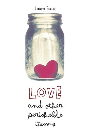
Lowercase fonts/two different fonts in the same title
LOVE the lowercase titles, and ESPECIALLY love the two different fonts in the same title. Just like the way they look, guys.
If I Stay (If I Stay #1) by Gayle Forman
Linger (The Wolves of Mercy Falls #2) by Maggie Stiefvater
The Sky Is Everywhere by Jandy Nelson


