 Howl’s Moving Castle • Diana Wynne Jones
This book has been on my TBR for AGES. The copy I own I actually bought for my young cousin but never gave it to her. Instead of returning it, I kept it for myself and then it languished, unread, for a few years. Fast forward to our annual December powwow to pick our On the Same Page books for this year, and Alyssa was like, “I want to read HOWL’S MOVING CASTLE,” and I was like, “OMG ME TOO.” So glad that we all agreed to give this classic middle grade fantasy a go, because it was incredibly charming and fun, and I laughed so many times.
One of the things I noticed while I was looking at this book on Goodreads was the different covers. There’s so many! And they’re so awesome! And they highlight different aspects of the story, or have different interpretations of the same thing! YAY! So for this month’s On the Same Page feature, I’m going to share some different book cover editions and talk about why I looooove them all (well, most of them).
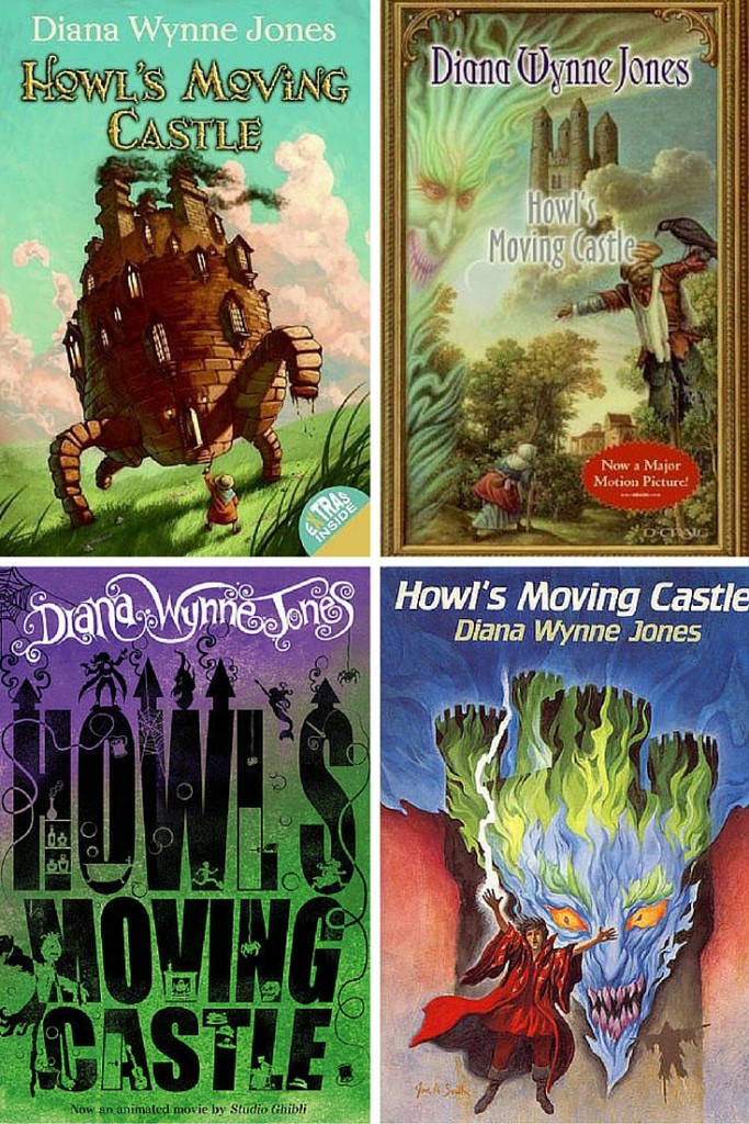
Here are some of the English-language covers that stood out to me. The one on the top left is the cover I have, and I really enjoy the brightness and the whimsical look. Lots of covers (as you’ll see in a second) have some version of the wizard Howl’s castle on them, but none of them look as harmless as this one does, which is, frankly, the way I saw it in my mind. I also see the cover on the top right quite a bit. I think this was one of the original covers, but it shows a lot more of the elements that make up the story than the one I own, namely Calcifer (he’s that floating, flame-y looking blue face in the corner) and the scarecrow. In 2009, Harper Collins did some redesign action and came up with the cover on the bottom left; I like. They redesigned the other two books in this series in the same fashion. I like all of these other covers more than the one on the bottom right, you guys. Any representation of Calcifer is much appreciated, but he looks so scary! I didn’t picture him that way. This is the first edition cover from 1986 and I CAN SEE IT.
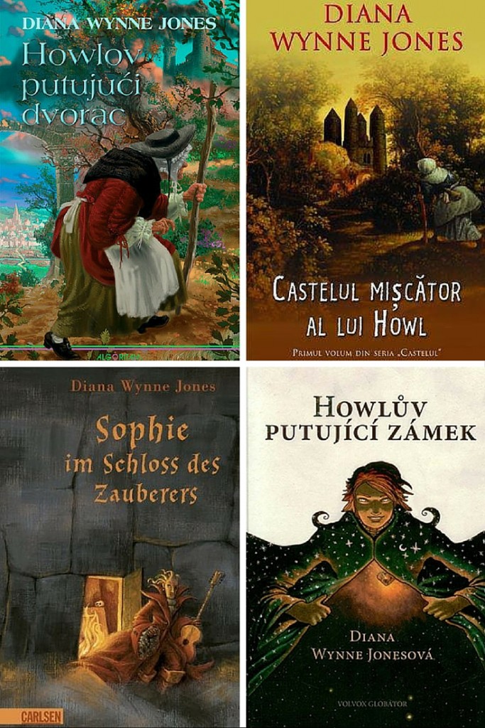
Now we get into some of the foreign editions, and we get totally new interpretations of all the things. Clockwise from top left, we have a cover of the Croatian edition, Romanian, Czech, and German. I really dig the Croatian cover, I think because of the colors. Also, Sophie is unquestionably the star, not the castle, which is excellent. I LOVED her. So snarky and tough. The autumnal vibe of the Romanian cover is also nice; it makes everything look so classical. I’m pretty sure that’s Howl on the Czech cover, but I can’t tell you how I know because spoiler. I like this cover, although it’s probably the least informative about the actual plot. HOWEVER, there’s a few little Easter eggs on it for some pretty biggish spoilers, and I do like that it doesn’t feature the castle at all. It’s a nice change. I’m going to try and ignore the fact that Howl on the German cover has legit Medusa hair and instead talk about how it’s got a few tiny little things on it that are cool to see.
Here are a series of foreign editions that have pretty fantastic looking depictions of the castle on them. Clockwise from the top left is the Spanish edition, French, Finnish, and Italian. There’s nothing really new about these covers, and no real hints about any other aspect of the story (the castle itself is obviously a big deal and a pretty amazing place, but there’s also way more going on), but THEY LOOK COOL RIGHT? They should because it’s the same two pictures colored slightly differently. Not too much imagination. I also don’t recall the castle being that steampunkish, but I can dig it. I love how it’s so random. It reminds me of the Burrow.
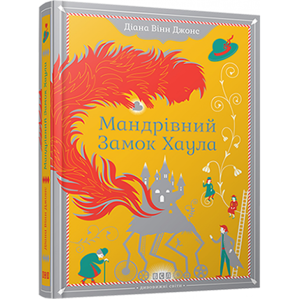
THIS COVER I NEED. It’s Ukranian, but it’s hardcover and gorgeous and mostly yellow and I just love it. Can I has plz?
I really had a blast reading HOWL’S MOVING CASTLE, you guys. It was full of humor and imagination. Howl had me laughing with his dramatics more than one time, and I enjoyed how Diana Wynne Jones used the modern world as a parallel universe. The Witch of the Waste was obviously important to the plot, but still a little absent. That’s ok, though, because Sophie and Howl and Michael and Calcifer were all incredibly enjoyable. I can’t wait to get my hands on the rest of the books in this series.


I’ve never read Howl’s Moving Castle either, though I do want to! I really like that you featured all these different covers today. They’re really fun to look at, and I really liked reading what you had to say about each as someone who has read the book!
I loved looking at all these covers! I agree with you- the Ukrainian cover is the best. I love the it! I have never read this book or seen the movie. I have even checked it out from the library but never got it. I really need to give it a try! I have heard so many amazing things about this one. I hope you enjoy it!! 🙂
Howl’s Moving Castle is probably my favorite book of all time, and I just love this round up of covers. I own the first two on here. The top right one I think was the cover in the late 90s/early 2000s, and is my original copy. I own the top left one because my beloved edition is starting to fall apart 🙁
And I NEED to get that Ukranian edition. I just love it.